
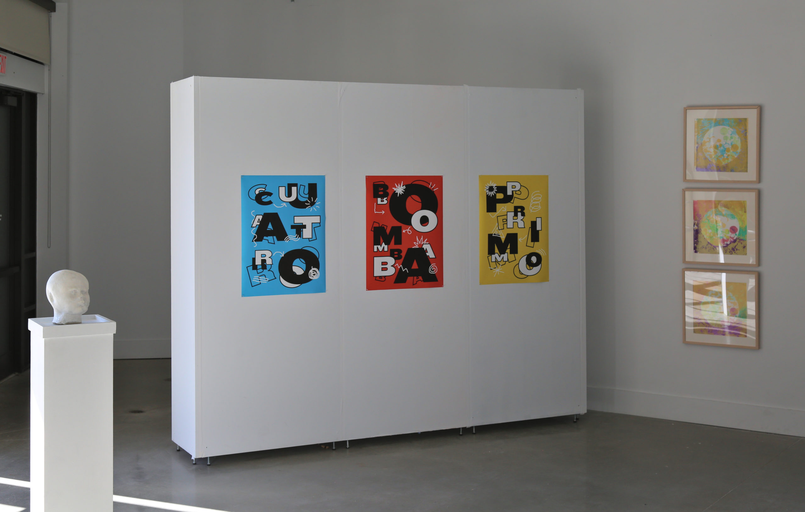
Jason Alejandro, Bomba, Cuatro y Primo, 24” w x 32” h, digital print on paper, 2021.
Photographs: George W Chevalier
Q & A with Jason Alejandro
Gallery director Margaret Pezalla-Granlund interviewed Jason Alejandro about his work in February, 2021. Alejandro’s work is included in the 2021 TCNJ faculty and staff exhibition, Envision Us.
Margaret Pezalla-Granlund: Good Morning. Thanks for participating. I guess first off- what I wanted to ask about was your work. Can you tell me a little bit about the work that you have in the exhibition? Like where it came from, what you’re thinking about. Just tell me about your work.
Jason Alejandro: A lot of the work explores cultural identity. As a Puerto Rican graphic designer I often look to various aspects of Puerto Rico’s culture, it’s visual and design history, and while learning about those things also try to find ways to express them or translate them through graphic design.
So for this particular poster series, I was interested in aspects of Puerto Rico’s music and its tradition of music. So one of the posters say Bomba, which is a traditional of Puerto Rican dance style and musical style it’s unique in that it is both the dance and music musical style, and so it is very much about the relationship or the energy between percussion and rhythm and the dancer and there’s a back and forth that really happen, like a conversation.
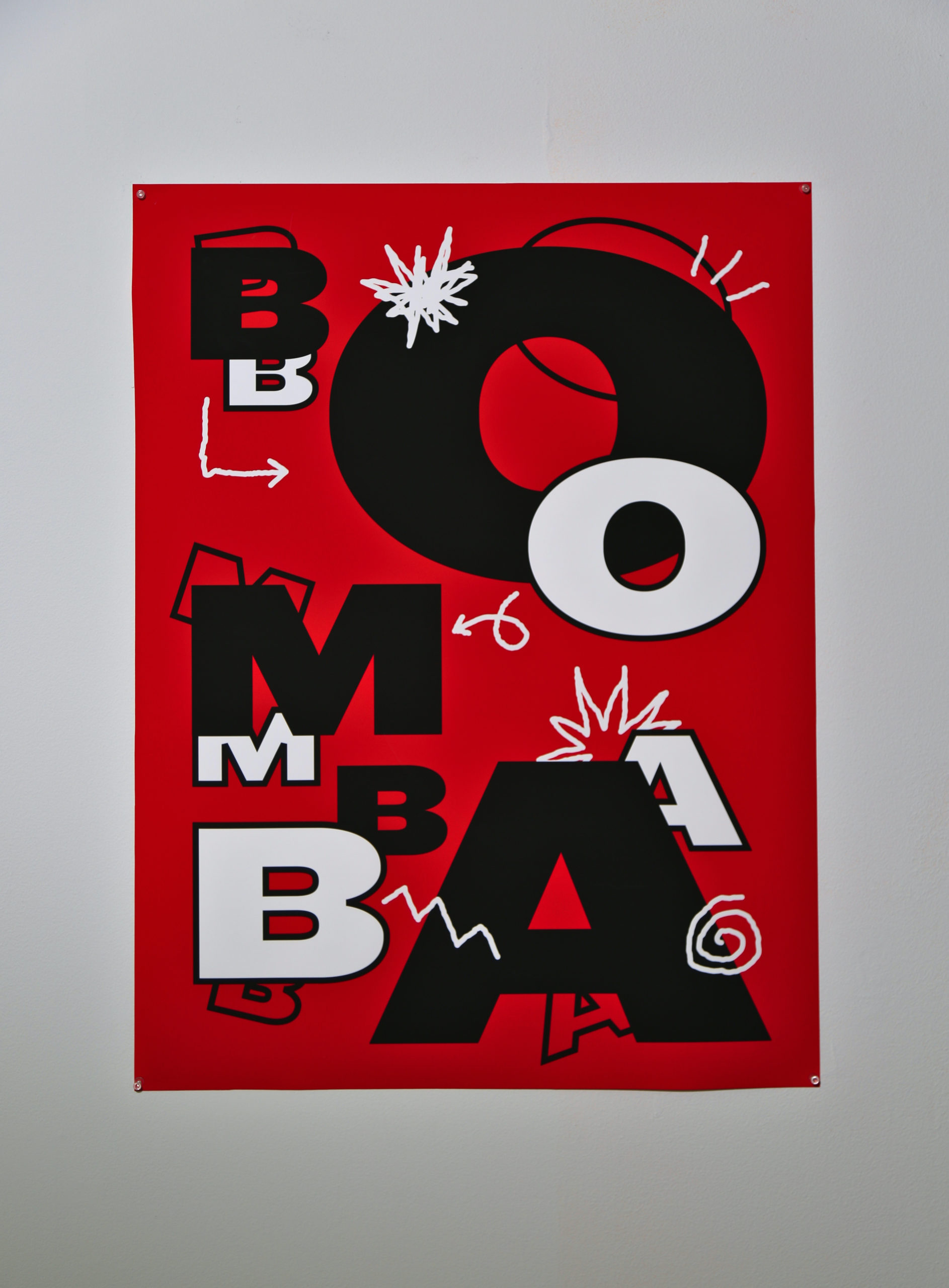
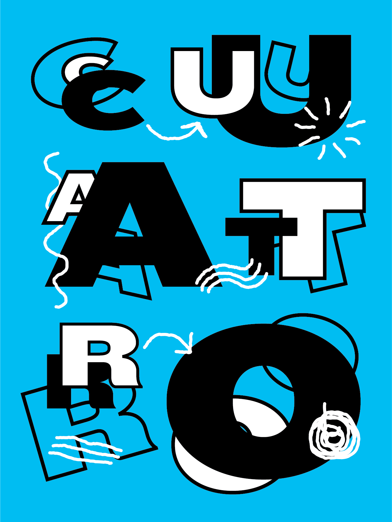
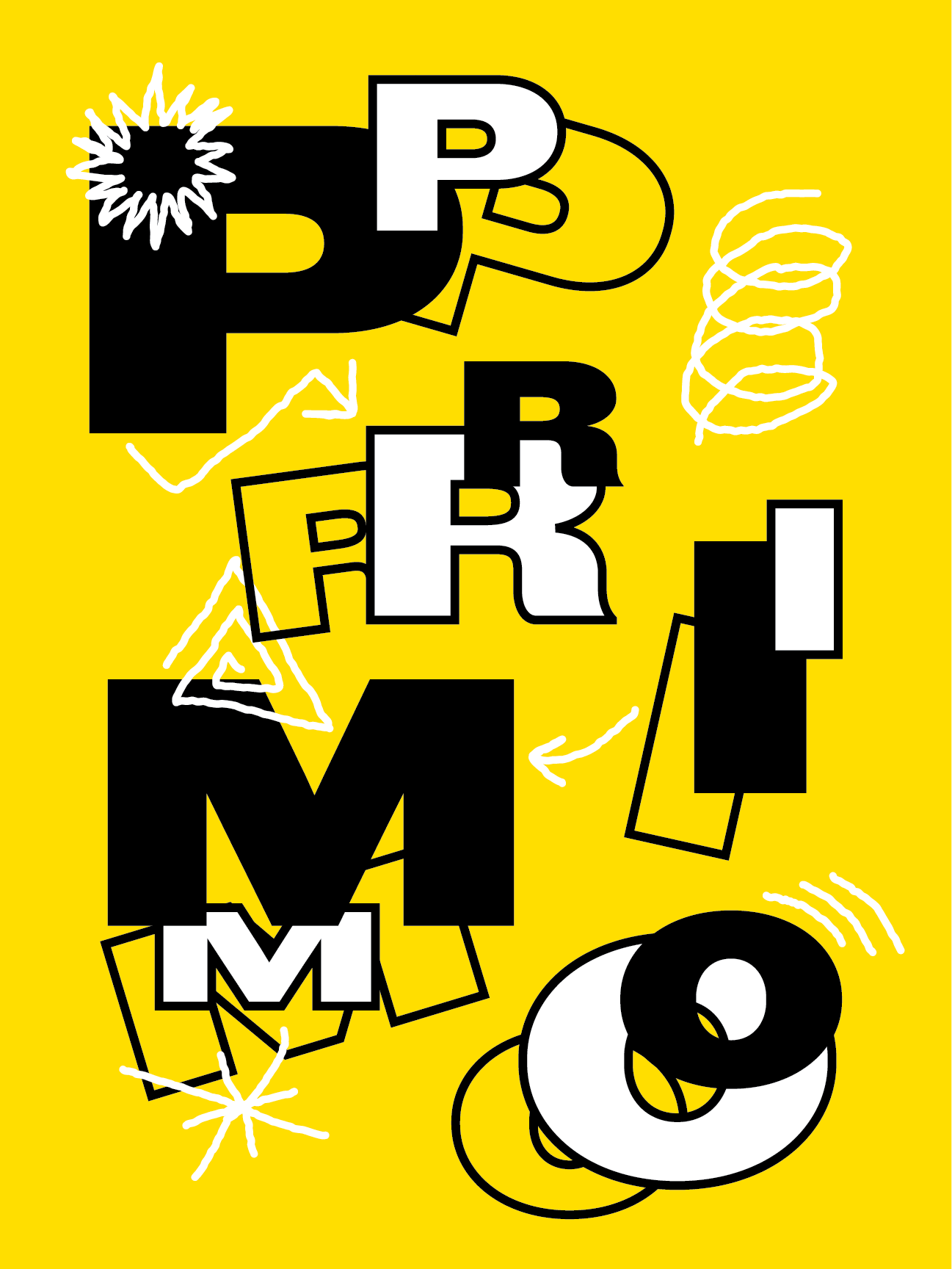
Another one of the posters says ‘Cuatro’, and that is a Puerto Rican guitar that essentially has 10 strings, which I find really unique that you know this tiny island has its own version of a guitar iconic to the island. And then the last poster says no and He baller on the student and Bomba and it has a sort of pitched sound and so… But that word, you know, has another meaning- (static)- in my work and the nature of those words and so you can kind of see some evidence of that with a visual layering that i’ve done on the posters.
But ultimately, I think that what the work does is try to create an awareness around and celebrate Black History in Puerto Rico since a lot of its musical culture is part of the Afro Caribbean culture, and a lot of its musical roots come from really, because of the African slave trade and Puerto Rico having been a major stop geographically in the African slave trade when the Spanish brought slaves to the island in the 1600s. So yeah, I kind of wanted to create an awareness around some of those themes and at the same time celebrate it. And so the posters themselves are quite bright and colorful and the typography is bold and I wanted it to feel musical in its, or rhythmic in its kind of tone.
MP: Well, that that leads me to my next question that I was curious about was; What is your process? Especially since you’re going from something that’s both like a Historical and Cultural reference and also something that is. You know that is in a musical tradition, like, how do you like what’s your process for developing these works.
JA: Yeah, I’m really I’m really interested in words ultimately at the end of the day, I really I think language is a really important part of what I’m interested in, and what I what I what I research, especially right now I’m really interested in this idea of linguistic relativity the idea that a.
Speaking another language being bilingual has some sort of impact on our cognition or way the way that we comprehend things and I very much see graphic design as a language, and so I think, for me, I tend to start with words as I’m doing research as I’m as I may be reading things or watching interviews or taking in information in the way that we do these days I’m also making note of different words that stand out to me or noticing the connections between words or and so sometimes my process starts out with lists of words. Which, fine yeah it could be in the notes on my phone they could be on pads of paper on my desk they could be, you know, on my kids IPad or something like around the house if that’s nearby, but I like to start with words. And then I sometimes sketch either thumbnails and things like that, and other times I’m just opening up the computer and I’m working in more traditional graphic design software, whether it’s Illustrator or Photoshop, or things like that.
And from there it’s really just a matter of kind of playing around with letter forms and words and colors and seeing what comes about. It’s a fairly, I think, straightforward process and I think, you know, sometimes I do try to incorporate either handmade elements or more of a handmade aspect to some parts of my work, but with these posters, it was a bit more digital.
But yeah, I’d say that that kind of building lists of words, is one of the ways that I work, especially when I’m trying to do something that’s more typographic in nature. And this particular work I think I’m also in some ways referencing, although I didn’t know it at the time, referencing a history or tradition of other Puerto Rican graphic designers and silkscreen artists or screen printers who have made posters during the 20th century.
MP: Thank you. I like the idea of just starting from lists of words and like using lists of words is kind of a building block for projects. And my final question; I’m curious. What’s next? Is this series something that you want to continue? Are you excited about going into something else, like what are you thinking? What are you hoping there if you have a ton of time, suddenly, what are you going to be working on next?
JA: You know, I would love to continue the series.
I can definitely see myself extending this series and actually what I really would love to do is make the typography dance on these posters, so a goal of mine is to maybe use some kind of technology, like augmented reality, where you can hold your phone up to the poster and and maybe the letters with dance or do something like that. But one of the one of the aspects of this project that is meaningful to me is the fact that I’m able to use graphic design as a way to as a language as I, as I mentioned previously, where my Spanish isn’t always so great and and I’m not the best answer.
But if I can have my work kind of do that for me, I think that’s a really interesting way to to kind of express identity and culture.
MP: Cool, I love that. I love that idea, and I like the idea of thinking about how to make them actually move and that seems like that would be a real continuation of what you’re thinking of both with the connection to the music and the dance.
MP: And the idea that the language of graphic design can do something that maybe you’re not as good at doing right. Thank you so much, this is great.